When it comes to website design, netizens are not very forgiving of poorly designed websites.
Table of Contents
They take one look at a website and make 94% of their first impressions based on design alone.
What’s more, they are also using this time to decide whether they think the website is credible at all or not.
According to statistics, 74% of a website’s credibility is attributed to its design aka appearance.
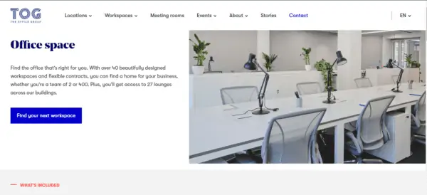
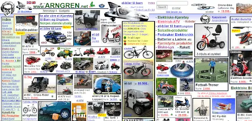
You may think that’s unfair. But let’s consider these two websites:
Image: TOG
Image: Arngren
Looking at these two examples, I think it’s safe to assume which one you’ll trust with your time and money more than the other.
In the same way, a brand logo builds a business’s personality and character, a website ensures the survival and success of the said business.
So what are the top pro tips that can help you fix up your website design and turn it into a money-making machine? Let’s find out.
Website Navigation
A rule of thumb in the website navigation world is that it should only take 3 clicks for a visitor to land on any page of your website from any other part of the site.
It encourages site exploration, increases time spent on a page, and improves user experience, resulting in higher conversions.
How to improve your site’s navigation:
- Use descriptive labels. Instead of ‘Product’ and ‘Services’, use the names of specific products or services you offer. For example: ‘Body Lotions’, ‘Hair Care’, and ‘Spa Bookings’. Specific product labels not only help visitors but also help search engines rank your pages better as they focus on a single topic.
- Rearrange menu items. Menu items that are clicked the most should be on the top or the bottom of the list. Average-performing items should come in the middle. Human cognition is biased towards items that we see the earliest (Primacy effect) or the most recent (Recency effect).
- Make navigation responsive. Your navigation bar should not change its architecture or design when viewed on mobile. Keep it consistent and add responsiveness to the design.
Check out this article for more on website navigation best practices.
Mobile-friendly & Responsive Web Pages
While we are on the topic of the responsiveness of websites, consider this statistic: 52.2% of all website traffic is generated from mobile phones.
Search engines also don’t care deeply about web pages that aren’t mobile-friendly.
A few ways to increase your site’s mobile-friendliness and make sure every page is responsive:
- Mobile-first approach. Google has a mobile-first indexing policy which means your site’s mobile version will be indexed for rankings before the desktop version. Therefore, use a mobile-first approach when designing.
- Optimize images. High-quality images are necessary to make a site look presentable and ‘worthy’ to visitors. Optimizing images will ensure that they load faster on mobile phones and keep their quality intact.
- Buttons on the site. The buttons on your website must be easily clickable on smaller screens. Increasing the size of the clickable area is a great way to achieve that.
Internal Linking
Internal linking is part of the bigger link-building strategy that ensures a strong SEO base for your website.
With different parts of your website directing visitors to other areas of the page or the site, and each of them containing important information for the audience, it increases your web page rankings.
To improve your site’s internal linking, here are a few tips:
- Use specific key phrases. The anchor text on the page you want to link must be specific. Instead of ‘click here’, use targeted phrases such as ‘check out our link building guide’.
- Link high-traffic pages to high-converting pages. Analyze your traffic and conversions and try organic ways to link pages that bring high traffic with pages that convert well. This way, most of your traffic will be routed to pages that increase conversions.
- Limit the number of links. Keep the number of internal links to 100, max. Fewer internal links mean more authority for each internally linked page.
Call-to-Action Buttons
CTA buttons make decision-making easy for visitors.
The clearer and more direct a website’s CTA game is, the easier the experience.
Customers also feel encouraged to use a website that lays out its goals, what it wants from you, and how it can help you solve your problems.
Some tips that will help you use CTA buttons more effectively:
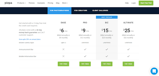
- Use a Verb. Tell people what action you recommend they take on a certain page. Use verbs. ‘Get a quote’, ‘Download eBook, ‘Submit a request’, ‘Call to book an appointment’ and such are clear, specific calls to action.
- Remain concise. Use no more than three words. Keep it simple, to the point, and action-oriented.
- Smart colours. Use complementary colours for your CTAs so people can easily distinguish them from the rest of the text on the page.
Image: Pixpa
Contact Forms
Contact forms perform as lead generation tools for websites by giving visitors multiple ways they can connect with the business.
A contact form for each of the different services, or on specific help topics, etc.
can help a business collect valuable customer data and will also know which customer is interested in which service or product.
There are a few ways you can use contact forms to your best advantage:
- Optimize field labels. The field labels on your contact forms should be optimized for the specific CTA or service you’re designing that form for. For a booking form, for example, ask about ‘Type of Booking’, ‘Preferred Dates’, ‘Number of visitors, etc.
- Thank-You Page. A thank-you page after a contact form is submitted encourages the continuity of the conversation between the visitor and the business. Try investing in that.
- Keep it simple. Only ask for the information that you need. Don’t hinder the user’s experience by asking lengthy, unnecessary questions or asking them to fill out multiple forms. A list of pre-designed questions included in your contact forms may further help matters.
For more on contact forms’ best practices, here’s a useful article.
Spruce Up the Content
Your website content is the meat for your site’s skeleton.
This is what a huge part of your SEO is based on, thanks to content marketing.
While people may make snap judgments about whether a site is useful or not based on looks, useless or depthless content will cement such judgments.
To turn things around for your website, create content that is informative, knowledgeable, authoritative, engaging, and encourages discussion.
- No technical jargon. Use simple and useful vocabulary that most people can understand and benefit from. Search engines are looking for content that people find valuable.
- Use bullet points and lists. Lists keep everything neat. Since the majority of visitors only skim the content, lists make sure that a high portion of your content will be consumed and hopefully shared with others.
- Subheadings in paragraphs. Paragraphs that use subheadings are a dream come true for content marketers. They are so much easier to link, build authority, and easier for search engines to crawl for keywords and relevant phrases.
Conclusion
There are dozens of ways to improve your website’s designs.
Take advantage of your site’s analytics and figure out the areas where your site may be performing poorly.
Knowing your weak areas will help you build a better business.
Hopefully, the information we’ve shared here will help you arm up your web design plans and enjoy richer results.
If you know ways to fix up website designs in more unique ways, shout out in the comments below and help the community.


