A goldfish has an attention span of only 9 seconds but did you know that it is a second longer than humans with a mere 8 seconds?
This fact should be on your mind if you are aiming to create a stunning web design in order to convince people to stay on your site. You should never miss the chance to grab the attention of customers or you would risk having them move into another website.
Aside from keeping their focus on the website, one of the ultimate goals should be to convert the visitors into purchasing customers.
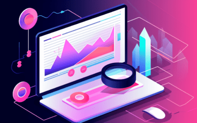
In a nutshell, Conversion Rate is the percentage by which visitors are influenced into completing the goals of your business, usually into making a purchase.
A higher conversion rate indicates a successful marketing and effective web design. Results show that only 22% of businesses who participated in a survey conducted by Wordstream are content with their current conversion rate.
This figure says a lot about how there are plenty of people who are not able to achieve satisfying results in boosting their conversion rates.
Furthermore, research shows that users are more likely to abandon a website for up to 5x more if the web design is not responsive.
This would mean losing a lot of audiences and potential sales. Aside from optimizing the website for responsiveness, there are a lot of other ways that you can increase the conversion rates for your website.
Here are the 7 essential web design concepts you need to consider in order to boost your conversion rate:
1. Have a Good Web Design Layout
One of the most effective ways to increase conversion is to actually make the user experience better.
UI/UX designers are constantly innovating in terms of making layouts that are easier to navigate even for non-techy users.
Most of the web design layouts that are approved by a lot of users are those that provide a seamless and memorable experience.
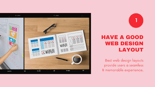
A good example would be sites that have clear navigation and highlights the call-to-action areas and headlines using plenty of white space.
A straightforward menu is efficient and encourages the visitor to scroll down if he or she wants to learn more.
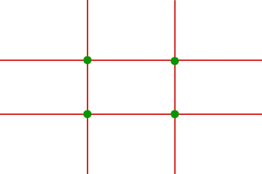
Another relatively simple method that works is using the rule of thirds. It works well on photography and it will be just as effective when designing your web layout.
Essentially, you only need to make use of an overlay wherein there are two horizontal lines intersecting equally with two vertical lines.
The points where the four lines intersect are where users naturally look at when visiting a website.
With this in mind, CTAs and other elements that you want to be highlighted should be placed on those points.
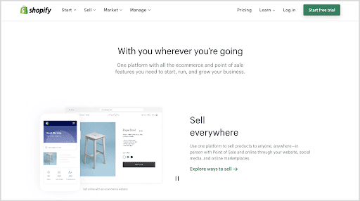
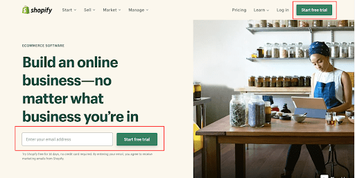
For e-commerce sites, you would do well in terms of conversion when you copy the same principle as what Shopify is using.
The web site is organized and a lot of white space is used. This is perfect for online shoppers who tend to skim through the pages.
Shopping becomes a breeze since all information that the shopper needs is there in plain sight.
There will be a huge difference if you are going to design the layout by applying these very simple methods.
They are mainly based on natural human psychology so they are expected to really work in your favour.
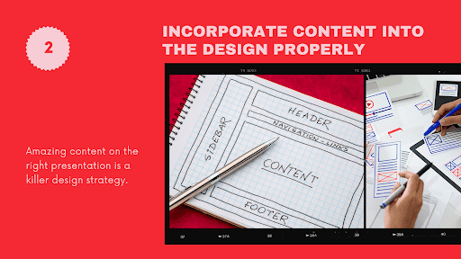
2. Incorporate Content Into the Design Properly
Creating a new design can be exciting that you will tend to lose focus on creating quality content. Although web designers would insist that the design should be above anything else, remember that content is equally important.
What needs to be done is to incorporate the content right into the early stages of the website design creation process.
It should not be the last step in launching a site. In fact, some designers find a lot of inspiration from good content. It encourages UI/UX designers to think of unique and effective ways to make the content be seen.
One of the best web design tips that you should live by is creating a roadmap for your project. It does not matter if it is specific or vague; just make sure that you are able to identify the different stages of both content production and the design phase.
You may create this roadmap by asking yourself several questions like how much new content should be created, how much time you need to review and make changes on the design, or do you have existing content assets that would influence the design?
After finding out the answers, you should be able to identify that the end goal should be the launch of the website.
On the other hand, you must also recognize that design may guide your content. There situations where you may find it fitting to add more content to fill in certain areas of the website.
You must keep your mind open for more possibilities as the design progresses.
Do not get stuck at choosing whether to create content first or have it after the design completion. Keep in mind that amazing content on the right presentation is a killer combination so they should be codependent with each other.
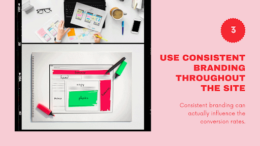
3. Use Consistent Branding Throughout The Site
Humans naturally gravitate toward what is familiar. You may not be aware but the use of consistent branding can actually influence the conversion rates.
Take a look at the power company, Apple. They have mastered the art of effective branding. The distinctive Apple logo is visible on all of its platforms. What they do is try to make everything look simple, sleek, and fast.
All of these qualities are attributed to the brand because they are being consistent.
When planning on your design, you should incorporate your values, beliefs, and goals into it. The audience should not be confused about your branding in order for them to trust you. Instead, every element in your branding should reinforce the image that you want the audience to see in your company.
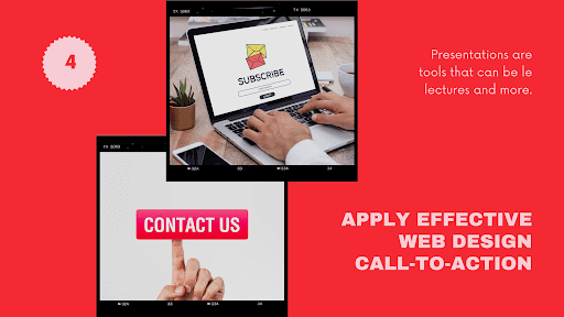
4. Apply Effective Web Design CTAs
Call-to-action or CTA is probably the most important link that should further convince the users to do what you want them to do on the website.
They are typically buttons or links that look compelling. But how do you make them work?
The first thing to understand about CTAs is how they are likened to asking out someone for a date or asking your partner into marrying you.
Officially, this “marriage” is the primary CTA and the “date” is only secondary. Examples of a primary CTA are buttons that say “Start Free Trial”, “Buy Now”, “Check Out Cart”, and “Make a Donation”.
Secondary CTAs, on the other hand, are those that would encourage the user to discover more about the brand before making a decision.
Examples for secondary CTAs include “Give Us A Call”, “Watch the Video”, “Join the Community” and “Keep in Touch”.
Basically, the secondary CTAs are used to ask the user for more dates until they are ready to “marry you”.
As a rule, you should have both primary and secondary CTAs in order to cater to all types of customers. Most customers, especially those who visit the site for the first time, will be skeptical about your products and services. You must be able to give out enough secondary CTAs to keep them informed and be confident with your company.
Sometimes, customers may be confident enough to take the plunge so the primary CTAs must be there to complete the action.
It also matters to know when to ask the question or where to place the CTAs. Studies show that the eyes are more likely to get drawn in the upper right-hand corner of the web page.
This is why carts and other CTAs are usually placed on that spot. That area should be free from clutter so that the user can focus on the primary CTA.
The secondary CTAs should be sprinkled throughout the content and serve as useful links to help them decide.
Just like in real life, it also creates a huge difference in the outcome when you are able to use the right words for the big question.
Figure out how you can spice things up and avoid boring CTAs like “sign up for our newsletter”. Be creative in enticing your audience.
You can instead say “get tips now” or “talk to an expert” if you are directing the user to connect with your team.
Lastly, do not lose the connection after the user approached the initial touchpoints. Send out mail updates or post relevant content to keep them engaged.
Prime them up for them to want to marry you by making frequent updates on channels that they visit, such as social media, blogs, or emails.
5. Make Your Website More Interactive
Incorporating interactive content encourages the user to stay and participate. Cool animations and multimedia content are engaging which will more likely create an instant connection.
Just make sure that making the site interactive should never affect the whole user experience in a negative way.
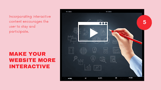
Everything that you add to the site for more interaction should be optimized. They should not make the loading time slow so that it could get boring.
More importantly, what you add should be relevant to the content for them to be able to relate and get interested enough to convert.
6. Use Color and Contrast Effectively
Colour has been tested enough to prove that it is one of the most effective visual cues. Choosing the right colours for the website is important because it should convey emotions that can lead to a conversion lift.
Each colour portrays a different emotion like Red denotes a sale, or that green is reserved for eco-friendly companies.
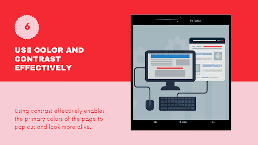
Aside from choosing colours, it is equally essential to check if they are in perfect contrast to the rest of the web design. Two dark colours do not usually contrast very well and may look too stiff.
The idea of effectively using contrast is to enable the primary colours of the page to pop out and look more alive.
The right combination of background and foreground colours should work with the design in order to achieve a coherent theme.
7. Source High-Quality Images, Illustrations and Graphics
High-quality images can make a website look more professional. Being particular with how each picture, whether they are photos, illustrations, or graphics, says a lot about your brand’s quality of products and services.
Images can either make or break a deal and low-quality images can drag the site and the whole brand down.
Compelling images can get up to an average of 94% views compared to using irrelevant and bland images. High-quality photos can help make the pages look personal and authentic—qualities that most users look for in a brand.
It also matters how you present the photos. Like when you are editing photos for the website, make sure to avoid being sloppy. Get a reliable tool when you remove background, for example, as it would affect the quality of the photos.
Avoid turning visitors away by making sure to have high-quality, professional images for your web design.
Additional Tip: Your Web Design should be Mobile Friendly and Should Load Fast.
Users no longer rely on desktops to visit websites. In a study made in 2017, mobile traffic dominates the total global web traffic to as much as 52.64%.
This is why your web design should be optimized for mobile use.
One big reason why users tend to browse websites on their phones is because of convenience. They like to do things simultaneously and never waste a minute of their time.
It is crucial to keep everything fast especially the loading of each page. A fast-loading website would keep your audience happy so you are guaranteed to keep them engaged on your site.
Wrapping it up…
Increasing the conversion rate is typically related to how you are able to reach the users on a personal level. An effective web design is a huge factor in boosting conversion rates because it helps direct the user towards helping you attain the goal of the site.
With these principles, you can see how it is essential to keep track of how the users’ reaction to web design can affect their future actions, thereby affecting leads and sales.
If you are able to apply these principles, rest assured that your web design will work in your favour.
Vancouver SEO Agency is a top-ranked b2b website design company. Reach out to us for a modern, high-converting, and SEO-dominant website out-of-the-box.